What fonts to use for coding
It's become a complicated question
I just bought a new laptop after 3 years so it’s time to fiddle with settings. One of the most important questions for a coder like me is what font to use for programming. I’ve been using the Fira Code font for several years and maybe it’s time for a change. There’s a nice website programmingfonts.org that lists fonts designed for writing code, but it’s mostly browsing things for aesthetics, not issues.
For coders, the most important issue is differentiating characters that look similar, like the letter O from the digit 0, the various versions of the letter ‘i’, 'l’, and the number ‘1’ (“iIlL1”). This can be confusing when reading text as humans, but if there is a mistake, disastrous for computers reading code.
The traditional monospace font “Courier New” does a poor job making this distinction.
The macOS developer tools defaults to the “Monaco” font that does a much better job:
There’s a whole lot going on between these pictures. As for the O0 issue, you see that it puts a slash through the digit 0, which has been used for decades by programmers to differentiate the digit. We also see the stick characters much better differentiated.
Stylistically, it gets rid of all the unnecessary serifs of the typewriter font, it’s not only monospace but also san serif. It still adds some serifs to the letters i and l, but that’s necessary to fill out the space, so that these characters that a letter like ‘l’ and ‘m’ take the same width.
It addresses some less well-known confusions, like g9qCGQ. You see it does a better job here than traditional Courier New.
It also handles the extremely rare issue of “db qp” differentiation. These are letters commonly switched by dyslexics. Therefore, new font designers make sure that they are not mirror images of each other. If you look closely at the Monaco font, you’ll see that they are not mirror images.
In short, the Monaco font that comes as the default for the macOS developer tools and editor XCode is a very good choice.
I’ve been using Fira Code for the past several years because I like its ligatures.
This is a similar sans serif, monospace font like Monaco. The major difference is the ligature that combine two adjacent characters together. Whereas the code represents an arrow as the two letter combination, the ligature shows a single double-width arrow character. Likewise, where as the code represents the “not equals” as the two characters !=, the ligature combines them into a mathematical “not equals” that’s double-wide. The replacements still fit in the same space, but look different.
This is not how ligatures were intended to be used. They were intended for correcting oddities when two characters were connected to each other, to make stylistic improvements. This is an abuse of capabilities of fonts for a very different purpose.
Some programmers hate such ligatures, while others (like me) love them. My goal for coding fonts is whichever supports ligatures, as well as being a sans-serif monospace font.
A further feature of fonts is syntax highlighting. This is often handled by simply changing the color of the font, as in the above example. But other options can be used. In the following example, the “string” has been reconfigured to be bold:
They’ve been gradually extending the font rendering capabilities of operating systems (Windows, macOS, and Linux) and browsers. They’ve gotten pretty crazy. The latest hotness in coding fonts is one called Monaspace (spelled slightly different from monospace).
Among it’s features is slightly tweaking characters depending on context. They call this “texture healing”. an example is shown below, where the strings “limit” and “amend” are shown with the ‘m’ character lined up in the same position.
It’s still a monospace font, where every character takes up the same amount of space, but notice how in “limit” the ‘m’ letter has been made wider, to fill out more space, while in “amend”, it doesn’t have space to expand.
It’s a subtle effect and can otherwise be missed.
Whereas the other screenshots used Apple’s XCode editor, the above screenshot uses Microsoft’s VSCode instead. Apples editor doesn’t support these features yet.
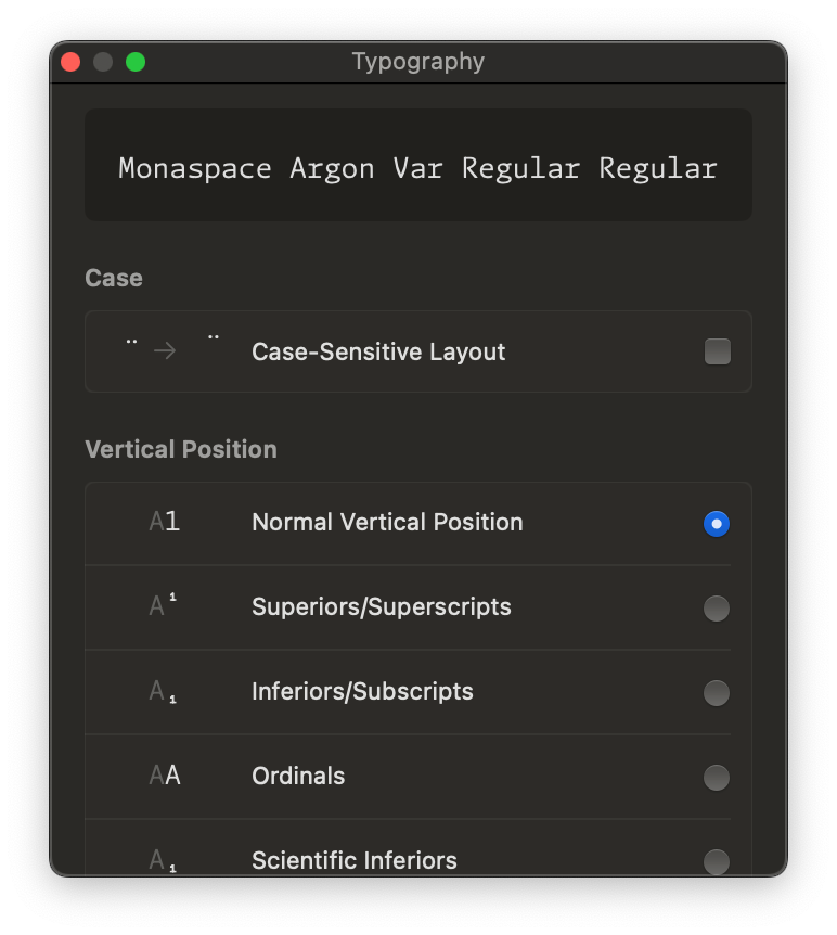
And I don’t understand why. When you select a font for XCode, it allows selection of typographic features like this. Fonts list such custom features so they can be turned on/off when selecting a font. The plumbing is there in the operating-system fond-rendering capability, it’s just that XCode isn’t using it. (I have the same problem with the Terminal fonts).
Conclusion
After my search, I’ve decided that I’m going to stick with Fira Code right now, for the ligatures, but use Monaspace for the Visual Code editor (and anywhere else I can get it to work), because I like to geek out on such font features.


